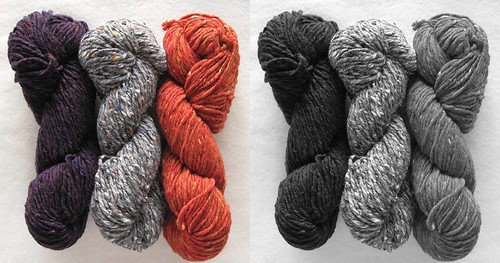
In my last post, I mentioned that my orange and gray yarns did not have sufficient contrast to work for the stranded pattern I was doing…when to everyone’s eye, it looked like there was plenty of contrast. SuCar described a technique for checking this out. You take a photo and then change it to black and white to see the actual contrast. I gave it a try:

Color photo on left; same photo in black and white on the right
Amazing, isn’t it? The orange just vanishes. And in the actual colorwork, this really played out. Thanks for the tip, SuCar!!
PS – don’t forget that tomorrow is the last day to submit your survey and to put your name in the running for our prize giveaway!!


An even easier way is to purchase a “ruby beholder” in Joann’s or your local quilt shop. Red clear plastic works also. look thru to see the value of the colors you have.
Comment by Robin F. — March 25, 2012 @ 7:56 pm
I discovered this a few years back when I was playing with the editing software that came with my camera. It really does a good job of aiding with color selection.
I’ve never heard of the “Ruby Beholder”. I may have to stop at Joann’s to get one.
Comment by Beverly — March 25, 2012 @ 8:40 pm
Wow — who knew? That’s a great tip. Thanks for sharing.
Comment by Wendy O — March 26, 2012 @ 7:58 am
Just wondering if you took a black/white picture of the grouping w the purple yarn you ended up using and what you found in terms of contrast?
Thanks for sharing!
Comment by PT — March 26, 2012 @ 8:49 am
Amazing is right. Thanks for the tip.
Comment by rebecca — March 26, 2012 @ 9:56 am
Amazing is’t it! It is the fact that both the gray and orange ‘read’ as medium values which means that although close up you can easily ‘see’ lots of contrast but at a distance they ‘read’ almost the same. Same principle applies with quilt blocks that call for light, medium and dark fabrics. Although you think certain blocks will pop they fall flat.
Comment by sue o — March 26, 2012 @ 9:57 am
That was an interesting experiment. It’s amazing how different they appear in greyscale.
Comment by technikat — March 26, 2012 @ 11:05 am
This is in response to comment #4 asking about your comparing the purple and gray you used. The two pictures actually do contain the purple, correct? It is the skein on the left, correct?
Also, I too will have to go look for a Ruby Beholder at Joann Fabrics.
Comment by Millie — March 26, 2012 @ 11:29 am
I would have never guessed that the orange was so close in hue (is it hue?) to the other colors! Thanks for sharing such a great lesson.
Comment by Samina — March 26, 2012 @ 11:34 am
This was so interesting – I’m really sort of amazed at the lack of contrast. I would have never thought it would be this way. Obviously, there is an awful lot to know and learn about color.
Thanks for sharing this with us!
Comment by Barb — March 26, 2012 @ 4:35 pm
Now that is cool — did you try it with the purple yarn?
Comment by Wool free and Lovin' knit — March 26, 2012 @ 5:23 pm
Great experiment. As others have commented, the issue here is that the yarns are close in value so they didn’t work well for colorwork. Other considerations in color are hue, or the “colorness” of a color and saturation, which is the intensity of the color. I didn’t know about the ruby beholder- very cool. What you can do without any tools is just hold the skeins together and squint your eyes. If they don’t pop against each other when you squint it is because they are too close in value.
I am also fascinated by color interactions- a skein of yarn may appear reddish or bluish or whatever depending on what color it is right next to.
This conversation brings back memories of design school- fond memories!
Comment by Deepa — March 26, 2012 @ 10:44 pm
Great tip! I will be over at the fabric shop looking for the “ruby beholder”.
Comment by Snowbird — March 28, 2012 @ 4:55 am